The countertop is the main work surface in the kitchen. If you already have an idea of what material it will be made of and what the finished kitchen will turn out to be, then it’s time to choose a shade of the work surface. In its selection, you can build on the design of the kitchen set and other furniture, as well as focus on the apron, walls, flooring and other surfaces. In the article, we will talk in more detail How to choose the color of your kitchen countertop stylish solutions., what interior elements to support it and what shades will be the most practical for the kitchen. The Most practical and stylish solutions.

How to choose a countertop for facades
The most obvious guideline when choosing a countertop is that the facades of the kitchen set. Shades don’t need to match: contrasting combinations also look beautiful.
Several harmonious options for an example:
- Snow-white facades + dark matte color countertops for a white kitchen;
- Cream, sand or beige facades + natural wood or brown granite worktop;
- Facades in gray or ash shades + white or dark gray countertops.
You can also make the surface to match the facades or individual cabinets (if they’re of various shades within the headset). But during this case, it’s important to feature contrasting elements to the inside so as to slightly dilute the monochrome kitchen. How to choose the color of your kitchen countertop stylish solutions. The Most practical and stylish solutions.

COLOR OF KITCHEN COUNTERTOP 
COLOR OF KITCHEN COUNTERTOP 
COLOR OF KITCHEN COUNTERTOP
Worktop in the color of the backsplash
Another option is a tabletop and an apron of the same color or overlapping shades. If the apron is not monochromatic, but tiled with patterned tiles, any tone from those used in decoration will do.
You can order a work surface made of the same material as the apron – you get a single harmonious cooking space.
Contrasting shades
The work surface does not have to match the color of the facades, apron or walls in the kitchen – contrasting shades also go well with each other and additionally enliven the interior. How to choose the color of your countertop The most practical and stylish solutions and ideas.
But when you look at a color guide, it can be difficult to immediately grasp the exact contrasts. In this case, here are a few design tips:
- A win-win option for the brave – the classic contrasting pair “black + white”;
- In a kitchen with blue facades, a work surface in warm reddish shades will look advantageous;
- If the kitchen has light green or turquoise elements, the contrasting countertop should be the color of mahogany or reddish granite, marble;
- A softened version of a contrasting kitchen – facades of warm pastel shades and a dark wooden work surface.

A versatile option for any kitchen – white or gray
Sometimes you don’t want to understand the color combinations. In this case, you can choose any of the light colors – they visually add space to the kitchen, and, moreover, they will suit almost every headset. How to choose the color of your kitchen countertop stylish solutions. The most practical and stylish solutions and ideas.
Two versatile options:
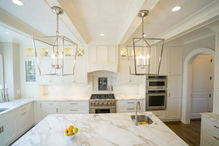
- White worktop – it will suit dark, white and colored kitchens equally well. A snow-white work surface will harmoniously look in a Scandinavian-style room or in minimalism, hi-tech styles, but, in general, it can be entered into any interior.
- The working surface is gray. This is also an achromat that matches every bright shade and is suitable for white or dark kitchens.
All kinds of pastel colors (sand, caramel, beige, milky) can also be attributed to universal ones, but make sure that the temperature matches the interior of the kitchen.
Stone countertop: rocks, shades and patterns
If you have chosen natural stone as a material, be prepared that the palette of available tones and patterns is very limited here. There are not many types of stone that are suitable for kitchen decoration in terms of characteristics, and this must be taken into account. At the same time, of course, a natural stone countertop will serve for decades and in appearance cannot be compared with artificial counterparts.
What “stone” colors of countertops are most often found in the interior:
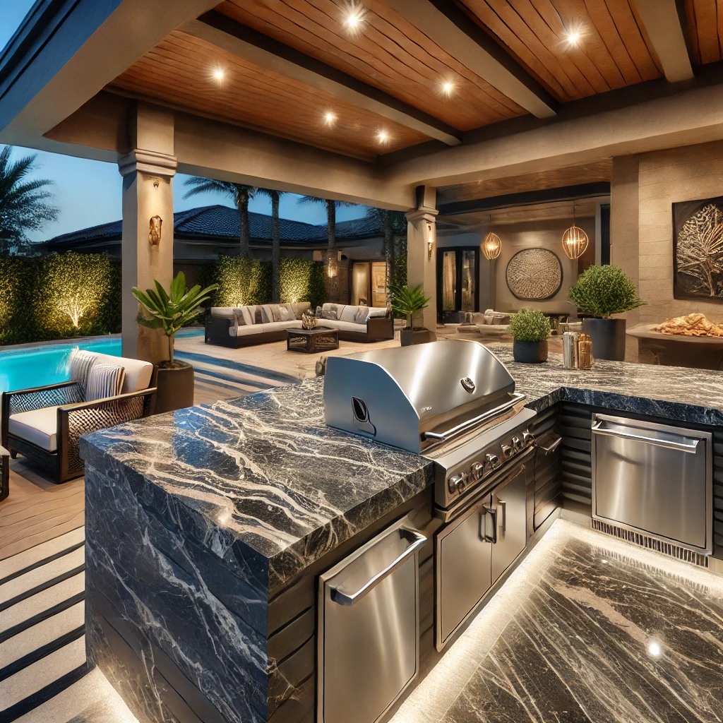
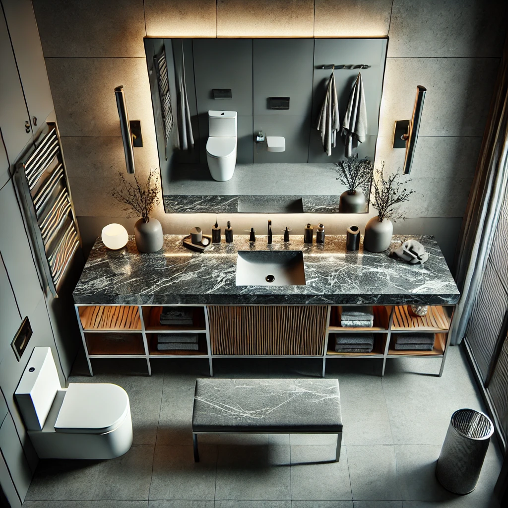
- Granite is a stone with a recognizable granular texture, which can have a gray, coffee, pinkish, scarlet, black, green undertone.
- Marble is a light stone with veins of red, black, greenish, chestnut color. An example of such a worktop can be seen in the Bianco Romano kitchen with a worktop in white marble with dark veins.
- Quartz countertops can be of almost any tone, the rarest option in nature is white quartz.
- Travertine is a finishing stone that is usually gray, brown, golden or white.
- Onyx is a stone that is easily recognizable by its characteristic large stains. It can be coffee, yellow, beige.
Another option is an artificial stone countertop. The quality of the material will be naturally lower, but the choice of textures in this case is much wider and is not limited to the natural characteristics of the stone.

How to choose a natural wood shade
If the worktop is made of wood, it is important to match it with other wood elements in the kitchen – consider the appearance of parquet or laminate flooring, kitchen door, dining table and other furniture. The following pattern works here: the color of the tree in the interior should be one, maximum – two. A third woody shade in the kitchen would be inappropriate.
Examples of available wood species and shades for kitchen decoration:
- Oak – white or bleached, stained, gold, chestnut, as well as dark wenge with pronounced veins;
- Beech – light golden wood;
- Walnut is a dark wood with a reddish undertone, the color can be of medium saturation or deeper;
- Alder – has a warm honey tint without dark blotches;
- Ash – light or dark, with clearly visible lines.
Rarer options are pressed bamboo stems, cherry or grayish terrado countertops.
Should I use bright colors in the kitchen?
Sometimes designers are not advised to choose bright facades or countertops for the kitchen: red, purple, lemon, turquoise and the like. The reason is that sooner or later you will get tired of any saturated tone. There is a deal of truth in it.
Therefore, if you still want to make the work surface bright, choose diluted, muted tones – they are not as active and look more noble. Be sure to reinforce the bright countertop with something else: furniture upholstery, decor, or other details. How to choose the color of your kitchen countertop stylish solutions. The most practical and stylish solutions and ideas.

How to choose the color of your countertop.
It is important that the work surface matches the shade of any other element in the kitchen. But besides the obvious options, when the color of the countertop is matched to the color of the facade or apron, any other piece of furniture can be a “companion”.
For example, the work surface can be supported:
- As a dining group – take as a basis the shade of the table or the upholstery of the chairs.
- Window sills. Usually the sill is at the same level as the countertop, so it would be an interesting solution to make both of these surfaces from the same material.
- Floor covering. If there is porcelain stoneware on the floor, then you can pick up a stone countertop close in tone and pattern to it. A wood worktop is a great match for laminate or natural parquet flooring.
- Curtains and other textiles in the kitchen (up to cloth napkins under the plates).
- Upholstered kitchen furniture – a bench, sofa or kitchenette.
- Wallpaper, plaster or paint on the walls.
What colors are the most practical
If you cook a lot at home, it is important to choose not only a beautiful, but also a practical work surface – one that will be less likely to get dirty.
What recommendations can be given here:
- The most practical colors for kitchen countertops are gray, brown, a shade of bleached wood, white (ideally, streaked or speckled). The countertop in shades of beige will also be easy to clean. On any light surface, water droplets and dust are much less noticeable than on a dark one, so they can be wiped less often.
- Working surfaces of black and other dark tones, especially monochromatic ones, without a pronounced woody or grainy stone texture, quickly get dirty. They literally attract dust, they show the smallest stains and scratches. Therefore, if you do choose a spectacular dark surface, be prepared for the fact that it will require careful maintenance.


Let’s summarize
It is important to mix the tabletop with other interior elements. There are many options: a kitchen apron, window sill, headset facades, floor, wallpaper pattern and even textiles in your kitchen can act as a companion – from curtains to napkins. For worktops made from natural stone or wood, special combination rules apply, and therefore the palette of colours is extremely limited here. Also, universal colors of the kitchen countertop are always at your disposal: white, gray, metallic silver. When making a choice, remember that a light-weight surface is usually more practical than a dark or, even more so, pure black.
Click for our other shop in King of Prussia